Sign Solutions has been our "Go-To" source for all of our Corporate sign, banner and vehicle branding needs for years. Their team is always extremely responsive and their product quality is exceptional for the price. We highly recommend the services of the Sign Solutions!
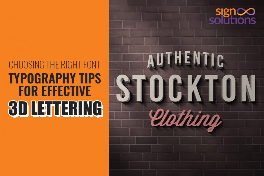
Choosing the Right Font: Typography Tips for Effective 3D Lettering
Introduction
This comprehensive guide explores the art of typography in three-dimensional lettering design, from selecting the perfect font to mastering visually stunning 3D lettering techniques. The details within the blog will help you elevate your design projects to the next level. Let's gear up to learn the secrets of crafting captivating 3D lettering that encapsulates the power of typography for the most beautiful visibility and brand awareness.
The Significance of Typography in Business 3D Lettering
Typography plays a crucial role in business 3D lettering. 3D lettering represents your company's brand identity in the most visually appealing form.
A mature choice of font, style, and text placement in 3D designs significantly impacts and enhances how your target audience perceives your business. Effective typography spells professionalism, creativity, and clarity about your brand, helping it stand out in this competitive market.
A 3D Sign Maker in Cayman can help you carefully select and craft typography in 3D lettering for your organization. His expertise will enhance your brand recognition, communicate your core business values, and create a lasting impression on your customers and business associates.
The impact of typography on 3D business letters
Typography has an important role in creating 3D lettering for your business. These 3D lettering greatly enhance your company's visual appeal and overall branding.
Here are some key points to consider:
- Font Selection: To create impactful 3D lettering, choosing the right font is essential. Fonts have their stories. Hence, different fonts convey unique emotions and messages. So, selecting a font that aligns with the brand's identity and correctly conveys your message will take your brand to new heights.
- Depth and Dimension: Accuracy is the key! A 3D Sign Maker in Cayman will suggest using typography in 3D lettering to add depth and dimension to the design. He specializes in creating visually stunning, striking, and engaging signage. Light and shadow add an extra layer of beauty to your lettering. Playing with shadows, highlights, and gradients makes the letters more realistic and attractive.
- Brand Identity: Typography is very relevant to your brand identity. The typography used in 3D lettering should reflect the brand's identity and business values. Whether modern, sleek, bold, or trending, an expert 3D LED Letters Vendor in Cayman will suggest typography that resonates with the target audience and reinforces the brand image.
- Consistency: Typography must be consistent across various marketing materials and channels to elevate brand recognition. Using the same 3D lettering style helps create a cohesive brand experience, whether on signage, digital platforms, or traditional print materials.
- Creativity and Innovation: People appreciate creative and innovative approaches, and innovation adds freshness to your product. 3D typography offers unlimited innovative creations. A 3D LED Letters Vendor in Cayman can use his experience to experiment with various effects, textures, and colors. Businesses can leverage this experience to create unique and memorable 3D lettering that distinguishes your brand from competitors
- Readability: Creativity is valuable only if your audience understands it in the correct context. Hence, it is essential to ensure the 3D lettering is readable. Balancing visual appeal with readability ensures the message is effectively communicated to the audience.
You will agree that typography is crucial in creating impactful 3D lettering for a business. It enhances brand identity, visual appeal, and communicative power. With a careful selection of fonts, precise depth and dimension, and consistency, companies and professionals can leverage 3D typography to leave a lasting impression on their audience.
Choosing fonts that impact brand perception strategies
The selection of fonts plays a significant role in shaping brand perception. It also speaks volumes about your communication strategies.
Here are a few key points to consider:
- Personality and Tone: Different font types convey different emotions and personalities. For instance, a children's clothing brand might use a playful, whimsical font, while a tech company would choose a sleek, modern font. The font choice determines how an audience perceives the brand.
- Consistency and Recognition: A constant use of a particular font across all brand materials helps create brand recognition. Customers often associate specific fonts with certain brands (or industry sectors), allowing them to identify and remember the brand easily.
- Legibility and Readability: Customers won't be interested in your brand or products unless the fonts are readable from a distance. So, a font's readability is crucial for attracting prospects and effective communication. Never opt for highly decorative or complex fonts, which hinder readability, especially in digital formats. Your 3D Sign Maker in Cayman can help you make font choices that are easily read across different platforms.
- Cultural and Emotional Impact: Fonts have existed since humans started understanding each other. Hence, some fonts have cultural connotations and prompt specific emotions. Experts recommend brands be mindful of this connection when selecting fonts. Following these criteria ensures the fonts resonate with their target audience precisely and in the intended way.
- Brand Differentiation: Before you build your brand, it is essential to make it unique. If you are unique, how can your brand be the same as your competitors? Hence, make proper font choices to help your brand stand out from its competitors. An exclusive or custom font can create a distinctive visual identity for a brand.
- Cross-Platform Consistency: Brands must discuss options with a 3D LED Letters Vendor in Cayman to visualize the appearance of their chosen fonts across various platforms and devices. To promote your brand on social media, you must confirm that the fonts are web-safe and compatible with different screen resolutions. This strategy helps maintain a consistent brand image.
Brand perception, communication of brand values, and how a brand is perceived by its audience are influenced by font choice and aesthetics. Therefore, it is imperative for brands to carefully consider font choices in conjunction with branding and communication strategies.
Aligning Typography with Brand Identity
Matching typography to your business brand
Aligning typography with a business's identity is essential for establishing a cohesive and impactful brand presence. Typography management includes font choice, size, spacing, and style. It also reflects the business's values, personality, and target audience.
For instance, a luxury or premium shoe brand may opt for elegant and sophisticated serif fonts to convey a sense of exclusivity and refinement. At the same time, a website development startup might use clean, modern sans-serif fonts to communicate innovation and simplicity.
Consistency in typography across all brand channels, such as websites, marketing materials, promotional ad campaigns, and packaging, helps create a unified and memorable brand experience.
By carefully aligning typography with a business's identity, companies can effectively communicate their message, build brand recognition, enhance brand equity, and establish strong customer connections.
Fonts focussing on the brand's personality and values
It is crucial for effective branding to select fonts that authentically represent the brand's personality and values while resonating with the target audience.
Fonts should reflect the brand's personality, whether bold, energetic, elegant, sophisticated, or friendly and approachable. By aligning fonts with the brand's identity, brands will convey their unique character and build strong emotional connections with customers.
Understanding the preferences and expectations of the target audience before choosing fonts is crucial. These fonts convey the desired brand emotion and help create a cohesive and resonant brand image that leaves a lasting impression. Fonts that authentically reflect a brand's personality and values appeal more to the target audience.
Legibility and Readability in Business 3D Lettering
Explore balancing style and clarity in business 3D lettering
Balancing style and clarity in business 3D lettering requires delicate art. Visually pleasing design elements must be balanced with clear, easy-to-read text.
3D LED Letters Professionals in Cayman can create 3D lettering with a striking style and effective information transmission. For this, these professionals carefully select fonts, colors, and spacing. This balance ensures that the business message is communicated with impact and professionalism. Hence, you cannot ignore the power of 3D lettering in branding and visual communication strategies.
Make business messages clear and legible
Ensuring legibility and effectively conveying business messages is crucial for successful communication.
Here are some strategies to help you achieve this:
- Use Clear and Concise Language: Your audience will appreciate simple, to-the-point messages. Avoid jargon or complex language that might confuse them.
- Break Down Information: Huge chunks of complex information might scare your customers. So, break and organize your content into easily digestible chunks. Instead of lengthy paragraphs, use bullet points, subheadings, and lists to make information more readable.
- Choose Appropriate Fonts: Your fonts should not cause eye strain. Hence, select easy-to-read fonts for your written content. Heavily stylish and decorative fonts hinder the user's readability; better avoid it. Font size matters. So, use a font that is comfortable to read. Font size between 10-12 points is an ideal choice.
- Contrast: An ideal balance of contrast and brightness is vital for superior clarity. To enhance readability, ensure enough contrast between your text and background colors. For example, use dark text on a light background or vice versa. Adequate contrast prevents your letters from getting merged into a lighter background.
- Whitespace: Whitespace is like a canvas for your 3D lettering. The more whitespace, the better it appears. Your 3D Sign Maker in Cayman can suggest the amount of whitespace required to prevent design congestion and help readers focus on the message.
- Visual Hierarchy: Your audience won't appreciate a flat structure where the heading, subheading, and rest of the text look the same. There must be some differentiation. Hence, use headings, subheadings, bold text, and different font sizes to create an appealing visual hierarchy. This visual hierarchy will guide the reader through your content and help him understand the message correctly.
- Use Visual Aids: Visual aids are equally important as a visual hierarchy. While visual aids add texture and charm to your content, graphics help your readers stay focused. Incorporating relevant images, infographics, charts, and diagrams helps drive your points and break complex chunks of text into easy-to-understand images.
- Proofread: People love error-free text. Errors are sometimes hilarious, but they can even harm your purpose of communication. Hence, experts recommend proofreading your content for spelling and grammatical errors. Typos can annoy your reader and damage your credibility.
- Call to Action: Every message must include a call to action. Your message is not correctly communicated unless the reader takes some action. It is mandatory to clearly state what action you want the reader to take after reading your message, whether visiting a website, making a purchase, or contacting you. A strong call to action enhances the effectiveness of your communication.
Examples for CTA:
Digital Marketing Strategies:
Join us for our exclusive webinar.
Register now to secure your spot.E-commerce Website:
Don't miss out on our limited-time offer.
Shop now to enjoy 20% off on your first purchase.Gym, Spa, and Fitness Club:
Join us to take your fitness journey to the next level.
Sign up for our 30-day challenge today.Personal Care Products/Services:
Become our VIP member and unlock access to special perks.
Raining Discounts: Sign up now.Personalized Skincare Clinic:
Visit today and get your custom routine.
Visit today and get 100% free skin analysis. -
Personalized Approach: Tailor-made messages separate you from the crowd. Focus on your target audience and study their needs. Use these insights to create engaging and relatable content. Address their issues and pain points. Offer them a solution to show that you understand them.
The above strategies will help you improve the legibility of your content and effectively convey your business messages to your audience.
Serif vs. Sans Serif: Implications for Business 3D Fonts
When considering the implications of serif and sans serif fonts for business 3D designs, it's important to note their impact on conveying a brand's identity and message.
Serif fonts can add a sense of tradition, sophistication, and elegance to a 3D design with decorative strokes at the end of characters. They are particularly effective for businesses aiming to convey a sense of timelessness or authority.
On the other hand, sans serif fonts, with their clean and modern appearance, are often perceived as more sleek, straightforward, and contemporary. They can work well for businesses that communicate innovation, simplicity, and modernity through 3D branding.
Ultimately, the choice between serif and sans serif fonts for business 3D designs should align with the brand's overall image and messaging goals. Make an informed decision about selecting the right font.
Effect of serif and sans-serif fonts on business 3D lettering
Considering the impact of serif and sans-serif fonts in business, 3D lettering is important because it directly impacts how consumers perceive a brand.
Serif fonts are distinguished by their decorative strokes, which convey tradition, elegance, and sophistication. They are suitable for businesses wishing to establish a sense of timelessness or authority.
Conversely, sans-serif fonts, known for their sleek, contemporary, and minimalist appearance, communicate innovation, simplicity, and modernity through their 3D appearance.
The fonts chosen for business 3D lettering must align with the brand's identity, business values, and overall messaging strategy to resonate effectively with its target market and create a lasting impression.
Identify how styles convey professionalism and modernity
In the design domain, serif and sans-serif fonts hold unique characteristics that communicate professionalism and modernity while aligning with distinct brand objectives.
With their classic and decorative features, Serif fonts often evoke a sense of tradition, sophistication, and authority. Hence, they are popular amongst brands aiming to establish a professional and timeless image.
Conversely, the sans-serif font conveys modernity, simplicity, and innovation. It is the perfect choice for brands that want a clean, cutting-edge appearance.
By strategically selecting between serif and sans-serif fonts, business owners can effectively communicate their brand identity and values, reaching out to
their target audience and achieving their specific branding objectives.
Font Weight and Thickness: Impression and Professionalism
Font weight and thickness are vital to shaping the impression and professionalism of written content. A bold font can convey confidence and authority, while a thinner font may exude elegance and sophistication.
Finding the right balance between these elements is key to creating visually appealing and effective communication that leaves a lasting impact on the reader.
Examine how font-weight affects business 3D lettering.
Regarding 3D lettering for the business sector, exploring font weight and thickness nuances is comparable to navigating the visual landscape of branding and identity.
Choosing the right font weight can enhance the letters' perceived strength and solidity, conveying a sense of stability and reliability. Additionally, adjusting the thickness can improve the design's sense of depth and dimension.
By carefully considering these elements, businesses can craft bespoke 3D lettering that captures attention and reinforces their professional image and presence in the market.
Learn to achieve a professional yet memorable balance.
Achieving a balance that exudes professionalism while leaving a lasting impression requires attention to detail and thoughtful consideration of various elements.
You should begin by selecting fonts that convey the tone and personality of your content, ensuring readability and clarity. Balancing font weight and thickness can create hierarchy and visual appeal. Effectively using white space can enhance readability and draw attention to key elements.
Finally, consistent design elements such as color palette and typography across different platforms can create a cohesive and memorable brand identity that resonates with your audience. This ultimately leaves a lasting impression of professionalism and quality.
Height and Proportions for Business Appeal
When creating 3D lettering for business appeal, height, and proportions are crucial in capturing attention and conveying a strong brand image.
The letters' height should be carefully considered depending on the distance from which the signage will be viewed; the larger the letters, the better the effect from a distance, while the smaller letters are ideally suited for closer viewing.
A visually appealing composition requires a harmonious balance between each letter and the others.
By carefully considering the size and proportion of 3D lettering, a business can enhance its visual presence and create a strong impression on potential customers.
Study about the letter height and proportions in 3D lettering.
The height and proportions of letters in business 3D lettering are key. They create a strong visual impact and maximize brand appeal.
The height of the letters affects readability and visibility. Taller letters are easier to read from a distance. Proportions are key. They ensure that each letter keeps a balanced relationship with the others. This creates a cohesive and pleasing design.
Businesses can convey their brand message correctly by adjusting the height and shape of 3D lettering. This can attract customers' attention and create a memorable visual identity, which sets them apart from competitors.
Designing a stylish layout for the business.
Creating a visually appealing setup that aligns with the business's aesthetics requires a thoughtful and strategic design approach.
Consider the brand's color palette, logo, and overall vibe to ensure cohesion and consistency. Incorporating elements such as textures, shapes, and spacing can elevate the arrangement and make it stand out.
The placement of each element in the arrangement can create balance and harmony. By focusing on every detail, from the choice of materials to the composition, an appealing arrangement communicates the business's essence and leaves a lasting impression on customers and visitors.
Adaptability Across Business Platforms
Seamlessly use 3D fonts on different business platforms.
Selecting a 3D font that is visually appealing, legible, and scalable is the key to maintaining consistency among different business platforms.
Testing the font across different platforms, such as websites, social media, printed matter, and other media, is essential to ensure it is readable and compelling. Customizing the 3D font's color, size, and depth appropriately for each platform will contribute to developing a cohesive brand image.
Businesses must fine-tune the presentation of 3D fonts across all business platforms to convey their messages and brand identity to their stakeholders effectively.
Strategies for consistent physical signage and digital marketing.
Maintaining consistency in visual identity from physical signage to digital marketing requires deploying cohesive strategies.
Businesses can establish a strong and credible brand image by ensuring that the logo, color scheme, typography, and overall design elements are consistent across all platforms. Your 3D LED Letters Vendor in Cayman can help you create style guides that outline the proper usage of visual elements for both physical and digital mediums. These style guides will serve as a reference point for maintaining uniformity.
Regularly reviewing and updating all visual assets will help you align with the established guidelines and preserve brand consistency.
Upholding a unified visual identity, whether on a storefront sign or a social media post, reinforces brand recognition, trust, and customer loyalty.
Contrast and Background: Ensuring Visibility in Business Signage
In the business signage industry, contrast and background in 3D lettering are vital in ensuring proper visibility and attracting visitors.
Businesses must incorporate contrasting colors and use related backgrounds to amplify the effect of the letters and make them stand out. Businesses can effectively communicate their message to potential customers using this technique.
The contrast between the letters and the background helps make the text easily readable from a distance and enhances the signage's overall visibility. 3D lettering adds beauty, depth, and dimension, making the signage visually appealing and engaging.
Your 3D LED Letters Vendor in Cayman can leverage his experience to create a perfect combination of contrast and background when designing 3D lettering for business signage. Companies can create impactful and memorable displays that leave a lasting impression on customers.
Contrast and background studies to make your 3D lettering visible.
The right choice of colors for the lettering and the background can positively impact the signage by grabbing the viewer's attention.
High contrast between the letters and the background helps make the text easily readable, especially from a distance or in varied light scenarios. You can use complementary colors that pop against each other to enhance visibility and make the signage more eye-catching. Additionally, incorporating backgrounds that starkly contrast the lettering can help draw focus to the message being conveyed.
When designing 3D lettering for business signage, companies can effectively enhance visibility, improve brand recognition, and attract more customers by paying attention to contrast and background.
Improving visibility and readability in business contexts.
Businesses must strive to optimize message visibility and readability in different contexts. Here are some tips:
- Know your audience: Understand your target audience and tailor your communication to their preferences and needs
- Use clear and concise language: Avoid jargon and technical terms. Avoid confusing your audience. Insist upon keeping your message simple and to the point.
- Choose the right format: What medium do you use to communicate? Presentations, emails, social media posts, or website content are possible mediums. Adapt your message for optimal visibility and readability.
- Use visuals wisely: Incorporate images, infographics, and charts to break up text and make your content more engaging and easy to consume. People prefer graphics and other creatives to purely written text.
- Concentrate on your design: To enhance readability, ensure a clean, visually appealing layout. Use consistent colors, font styles, and spacing throughout your communication.
- Test and iterate: Experiment with various approaches to confirm what works best for your audience. Collect feedback and data to improve your visibility and readability strategies continuously.
Conclusion: Elevating Business 3D Lettering
Business 3D lettering involves choosing fonts that reflect the brand's personality and properly communicating the message. Color choice has an impact on readability and visual appeal. Balance creativity and legibility to ensure effective communication in 3D designs.
When improving brand communication and making a lasting impact on the audience, font choices are crucial.
Fonts effectively convey the brand's personality, values, and message. By selecting fonts that resonate with the target audience and reflect the brand identity, businesses can establish a strong visual presence, build brand recognition, and create memorable customer experiences.
In this competitive market, carefully selected typography will help your company to stand out and foster brand loyalty and trust.
Sign Solutions:
Discover how Sign Solutions, located in Cayman's prime location, excels at developing innovative signage solutions to enhance your brand. Explore our range of services, including premium 3D lettering signage services, and uncover what makes Sign Solutions a favorite among brands.
3D Lettering:
One of Sign Solutions' premium features is its expertise in creating captivating 3D lettering. These three-dimensional signs add depth and dimension to your brand, making your message visually appealing and memorable. Whether for storefronts, office spaces, or events, 3D lettering from Sign Solutions will surely grab attention and leave a lasting impact on your audience.
Recent Blog
The Psychology of Space: Using Wall Graphics to Boost Employee Morale
Employees at any organization spend more than 33% of the day at their workplace. Hence, it is quite natural that the same workplace influences and sha...
Read More
Monument Signs: A Simple Guide for Businesses
Before diving into the topic and comprehending its business perspective, let’s understand what a monument sign is. The first thing we need to unders...
Read More
Essential Guide to Planning and Regulatory Signage
Are business signs limited to displaying the business names and their logos? No, business signs actually move beyond the traditions and add chapters o...
Read More
Is Bus Shelter Advertising Right for Your Business?
Even with so much digital noise all around, physical advertising has still maintained its power, place, and position.
Read More
Top Fleet Graphics Trends to Watch in 2026
Your fleet of commercial vehicles isn’t meant only for transporting goods. It goes beyond this basic purpose by converting into a powerful brand ass...
Read More
